In the digital age, a well-designed and optimized website homepage can be a powerful tool for driving conversions. A website’s homepage is often the first impression that visitors have of a business, and it plays a crucial role in shaping their perception of the brand. Therefore, it is essential for you as an entrepreneur, small business owner, and website owner to focus on creating a homepage that not only captivates visitors but also compels them to take action.
In this article, we will delve into the best practices for optimizing homepage design to enhance user experience, increase conversion rates, and ultimately drive business growth. Additionally, we will explore 10 exemplary websites with unique features that have successfully optimized their homepages for optimal conversions.
Benefits of a Well-Designed and Optimized Website
A homepage is more than just an entry point to your website; it’s a marketing tool, a customer service representative, and a brand ambassador. A well-designed and optimized homepage offers a multitude of benefits, including:
- Enhanced User Experience: A thoughtfully designed homepage with intuitive navigation and a visually appealing layout creates a positive user experience, making it easier for visitors to find the information they need.
- Increased Conversion Rates: Through strategic placement of call-to-action (CTA) elements and compelling visual content, an optimized homepage can drive higher conversion rates, leading to more sales, sign-ups, or other desired actions from visitors.
- Improved Search Engine Visibility: Optimizing a website’s homepage using SEO best practices can lead to better search engine rankings, making it easier for potential customers to find the business online.
- Building Trust and Credibility: A well-crafted homepage can convey professionalism, reliability, and trustworthiness, thus instilling confidence in visitors and encouraging them to engage with the business.
- Mobile Responsiveness: With an increasing number of users accessing the internet from mobile devices, a mobile-responsive homepage design is crucial for reaching and engaging with a broader audience.

Best Practices for Building and Designing a Website Homepage
When it comes to building and designing a website homepage for optimal conversions, several best practices should be followed, and they include:
- Define Your Goals: Before you start designing or optimizing your homepage, clearly define your objectives. What actions do you want visitors to take? Do you want them to make a purchase, sign up for a newsletter, request a quote, or download a resource? Your goals will shape your homepage’s layout, content, and calls to action (CTAs).
- Know Your Audience: Understand your target audience’s demographics, interests, pain points, and motivations. Tailor your homepage’s messaging, visuals, and overall design to resonate with them. Conduct user research, analyze website analytics, and create buyer personas to gain valuable insights into your audience.
- Clear and Compelling Value Proposition: Your homepage should immediately communicate what you offer and why visitors should choose you. Craft a concise and compelling value proposition that highlights your unique selling points and addresses your audience’s needs. This should be communicated in your page headline and other strategic areas of the website homepage to grab the visitor’s attention.
- Strategic Use of Visuals: Guide visitors through your homepage by using a clear visual hierarchy. High-quality images and videos can capture the audience’s interest and communicate the brand’s story and offerings effectively. Use headings, subheadings, fonts, colors, and white space to prioritize important information and create a logical flow. Ensure that your CTAs stand out and are easy to locate.
- Engaging Headlines and Subheadings: Capture visitors’ attention with compelling headlines and subheadings that pique their interest and encourage them to explore your website further. Use strong verbs, numbers, and questions to create a sense of urgency and curiosity.
- Intuitive Navigation: A user-friendly navigation menu with clear categories and easy access to key pages is essential for guiding visitors through the website.
- Compelling Call-to-Action: Your CTAs are the gateways to conversions. Make them clear, concise, and action-oriented. Use strong verbs and persuasive language to motivate visitors to take the desired action. Experiment with different CTA placements, colors, and designs to find what works best for your audience. Well-placed and persuasive calls-to-action prompt visitors to take specific actions, such as making a purchase, subscribing to a newsletter, or requesting a quote.
- Responsive Design: Ensuring that the homepage is optimized for various devices and screen sizes is critical to accommodating the needs of mobile users.
- Fast Page Load Speed: Optimizing the homepage for fast loading times is imperative for preventing users from bouncing due to slow loading speeds.
- Trust Signals: Showcase customer testimonials, case studies, awards, social media mentions, trust badges, and security certifications to instill confidence in visitors and encourage them to engage with the business. Social proof provides evidence that others have benefited from your products or services, encouraging visitors to follow suit.
- Personalization: Tailoring the homepage content to the specific needs and preferences of the target audience can enhance relevance and engagement.
Critical Elements Every Website Must Have
While the specific design and content of a homepage can vary based on the nature of the business, there are certain critical elements that every website must incorporate:
- Logo and Branding: The homepage should prominently display the company logo and effectively communicate the brand’s identity and messaging.
- Primary Navigation: It must contain a clearly visible navigation menu that allows visitors to easily explore different sections of the website. This is essential for a positive user experience.
- Value Proposition: An impactful statement or concise description that communicates the unique value the business offers to its customers should be featured prominently on your homepage.
- Visual Content: Engaging imagery, videos, or graphics help captivate visitors and convey the brand’s message in a compelling manner.
- CTA Buttons: Well-crafted and strategically placed call-to-action buttons guide visitors towards specific actions aligned with the business goals.
- Contact Information: Providing clear and easily accessible contact information, such as a phone number or email address, instills trust and facilitates communication.
- Social Proof: Incorporating social proof elements, such as customer reviews, ratings, and success stories, can boost credibility and influence visitor decisions.
- Responsive Design: Ensuring that the homepage is optimized for seamless viewing across various devices and screen sizes is crucial for a broad reach.
10 Examples of Well-Designed Websites and Their Unique Features
1. Apple
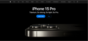
Apple’s homepage epitomizes minimalist design with its clean lines, ample white space, and emphasis on high-quality product imagery. Its concise copy highlights key features and benefits, while its strategic CTAs guide users toward exploration and purchase.
Why It Works:
- Simplicity: The uncluttered layout allows products to shine and avoids overwhelming visitors with information.
- Visual Storytelling: High-resolution images and videos showcase products in action, creating an immersive experience.
- Seamless Navigation: Intuitive menus and prominent search bars facilitate effortless exploration of Apple’s vast ecosystem.
- Lightning-Fast Performance: Optimized code and assets ensure the site loads quickly, even on mobile devices.
2. Airbnb
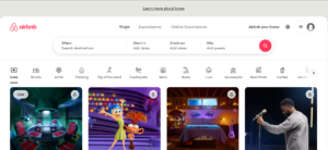
Airbnb’s homepage is a captivating invitation to travel and experience the world. It features stunning visuals of unique accommodations, personalized recommendations based on user preferences, and a powerful search bar that simplifies the booking process.
Why It Works:
- Emotional Appeal: Beautiful imagery sparks wanderlust and encourages exploration.
- Personalization: Tailored recommendations make users feel understood and valued.
- Interactive Elements: Interactive maps and filters streamline the search experience.
- Strong Storytelling: Compelling user-generated content (reviews, photos) builds trust and authenticity.
3. Dropbox

Dropbox’s homepage is a masterclass in clarity and conciseness. It succinctly explains what Dropbox does and how it can benefit users, using simple language and clear visuals.
Why It Works:
- Value Proposition Focus: The core message is front and center, leaving no room for confusion.
- Scannable Content: Short paragraphs and bulleted lists make information easy to digest.
- Visual Aids: Icons and illustrations reinforce key points and add visual interest.
- Prominent CTA: The call to sign up for a free account is impossible to miss.
4. Effe Towers

Effe Towers’ homepage is a clean and professional showcase of our expertise in web design, digital marketing, and business development. It features a clear value proposition, client testimonials, and a blog section with valuable insights and resources.
Why It Works:
- Clear Navigation: The menu is well-organized, making it easy for visitors to find the services they need.
- Compelling Headlines: Headlines highlight the company’s key offerings and benefits.
- Client-Centric Approach: Testimonials and case studies demonstrate the company’s track record of success.
- Thought Leadership: The blog section positions Effe Towers as experts in their field.
5. Mailchimp
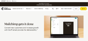
Mailchimp’s homepage exudes personality and playfulness. It features vibrant colors, whimsical illustrations, and subtle animations that create a delightful user experience.
Why It Works:
- Brand Personality: The design reflects Mailchimp’s fun and approachable brand identity.
- Visual Engagement: Unique illustrations and animations capture attention and encourage exploration.
- Helpful Resources: Blog posts, webinars, and guides position Mailchimp as a thought leader in email marketing.
- Clear Navigation: A well-structured menu makes it easy to find the right tools and resources.
6. Shopify

Shopify’s homepage is laser-focused on helping entrepreneurs start and grow their online businesses. It features a clear call to action, testimonials from successful merchants, and a wealth of resources to guide users through the process.
- Why It Works:
- Solution-Oriented: The homepage addresses the pain points of aspiring entrepreneurs.
- Social Proof: Success stories and testimonials build confidence in Shopify’s platform.
- Resource Hub: A comprehensive knowledge base empowers users to learn and succeed.
- Community Building: Forums and support groups foster a sense of belonging and collaboration.
7. Spotify
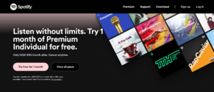
Spotify’s homepage is a music lover’s paradise, offering personalized playlists, new releases, and recommendations based on individual listening habits. The interface is visually appealing, with album artwork and artist photos taking center stage.
Why It Works:
- Personalization: Spotify’s algorithm curates music selections tailored to each user, enhancing the listening experience and fostering engagement.
- Discovery Engine: The homepage encourages exploration through “Discover Weekly” playlists, genre-specific recommendations, and curated radio stations.
- Social Integration: Users can connect with friends, share playlists, and follow their favorite artists, adding a social layer to music enjoyment.
- User-Friendly Interface: Intuitive navigation and search functions make it easy to find specific songs, albums, or artists.
8. Netflix

Netflix’s homepage is designed to keep viewers glued to their screens. It features a dynamic carousel of trending shows and movies, personalized recommendations based on viewing history, and intuitive categorization for easy browsing.
Why It Works:
- Binge-Worthy Content: The homepage showcases a vast library of diverse content, catering to a wide range of tastes and interests.
- Algorithm-Driven Recommendations: Netflix’s recommendation engine suggests titles based on individual viewing patterns, increasing the likelihood of user engagement.
- Preview Trailers: Auto-playing trailers provide a quick glimpse into shows and movies, enticing viewers to click and watch.
- User Profiles: Separate profiles for different household members allow for personalized recommendations and viewing history.
9. Tesla
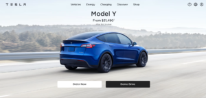
Tesla’s homepage is sleek, minimalist, and futuristic, mirroring the brand’s innovative approach to electric vehicles. It features stunning visuals of Tesla models, information about the company’s mission and technology, and a prominent call to action to explore their vehicles.
Why It Works:
- Visual Impact: High-resolution imagery showcases the sleek design and cutting-edge technology of Tesla vehicles.
- Innovation Focus: The homepage emphasizes Tesla’s commitment to sustainability and technological advancement.
- Interactive Elements: 360-degree views and virtual tours allow users to explore vehicle interiors in detail.
- Exclusivity: The homepage creates a sense of exclusivity and desirability around Tesla products.
10. Nike

Nike’s homepage is a celebration of athleticism, inspiration, and the “Just Do It” spirit. It features powerful stories of athletes who have overcome challenges, product highlights, and a strong emphasis on community and social impact.
Why It Works:
- Emotional Storytelling: Nike’s homepage evokes strong emotions through inspiring stories and powerful imagery.
- Community Building: The brand fosters a sense of belonging through social media integration and campaigns that encourage participation.
- Social Responsibility: Nike’s commitment to social and environmental causes resonates with conscious consumers.
- Product Showcase: The homepage seamlessly integrates product highlights with inspirational content, driving both engagement and sales.
Each of these websites excels in different ways, but they all share a commitment to user-centric design, clear communication, and a focus on achieving their specific goals. By studying these examples and applying their principles to your own homepage, you can create a digital storefront that welcomes, informs, and converts visitors into loyal customers.
Homepage Optimization Checklist
To ensure that your website’s homepage is optimized for optimal conversions take action!
GET A FREE COPY: Download Your Homepage Optimization Checklist
Don’t leave your website’s optimization to chance.
Download our comprehensive Homepage Optimization Checklist and unlock a wealth of actionable tips to better optimize and grow your website.
Click here to download your free checklist and take the first step towards a high-converting homepage.
This checklist is your roadmap to a homepage that not only looks great but also delivers real results for your business.
Professional Website Design Services
Are you looking to transform your website’s homepage into a high-converting asset that captivates visitors and drives business growth? Effe Towers offers professional website design services tailored to meet the unique needs of your business. Our team of experienced designers and marketers will collaborate with you to create a captivating and optimized homepage that resonates with your target audience and fuels conversions. Get in touch with us today to elevate your online presence and maximize the potential of your website!
Conclusion
In conclusion, the homepage of a website plays a pivotal role in shaping the visitor’s perception of a business and its offerings. By implementing best practices for optimizing homepage design, businesses can enhance user experience, increase conversion rates, and ultimately drive growth. Understanding critical elements such as clear value proposition, compelling visuals, intuitive navigation, and persuasive CTAs is crucial for creating a high-impact homepage. Additionally, learning from the exemplary websites that have successfully optimized their homepages can provide valuable insights for implementing effective strategies. By following the provided best practices, checklist, and seeking professional design services, businesses can harness the power of a well-designed and optimized website homepage to achieve optimal conversions and propel their online success.


